Skinary Case Study

Background
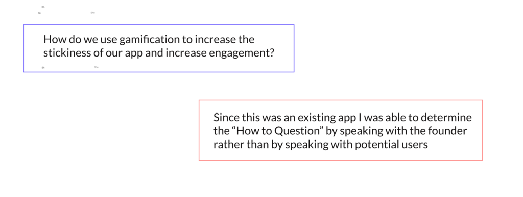
I was fortunate enough to work on a real world project for Skinary as my final project for She Designs, a UX certification program. Skinary is an interactive healthcare app that helps you develop a holistic skin care approach by tracking your daily habits to better understand how they affect your skin.
Initial UX Challenges: For a skin tracking app to really work, users have to develop long term habits and seeing results takes time. This means that users who are new to the concept have a potential to drop off, as they will not see results right away.
Solution : The Skinary team determined that gamification could provide a sense of achievement and reward users for completing seemingly mundane tasks. This would help the users stay engaged long enough to develop long term habits and reap the benefits of sustained app usage.
My Role: The Skinary team had worked on gamification in the past, but had abandoned the proposed features. My role was to redefine their proposed solution and create actionable gamification features that would increase engagement. I utilized a traditional Design Thinking Methodology to design these features.

Design Process
Competitive Analysis
Since the app had yet to launch, competitive analysis was extremely important as well as the process of empathizing with our potential users.
We sought to answer the following question:
- Who were our direct and indirect competitors and how did they interact with consumers?
- How would the market as a whole affect our future users perceptions of our app?
- How did the competitive landscape affect my work?
.
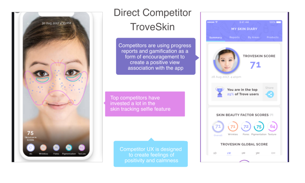
The closest competitor to Skinary we identified is TroveSkin. In the world of skin care tracking, image-based tracking seems to be essential. Similar to Skinary, TroveSkin also employs the heavy use of fun bright colors to give the app a feeling of lightness. TroveSkin utilizes competitive positive gamification by providing a skin score and notating how a user’s score compares to other app users, however no challenges or achievements are flushed out.
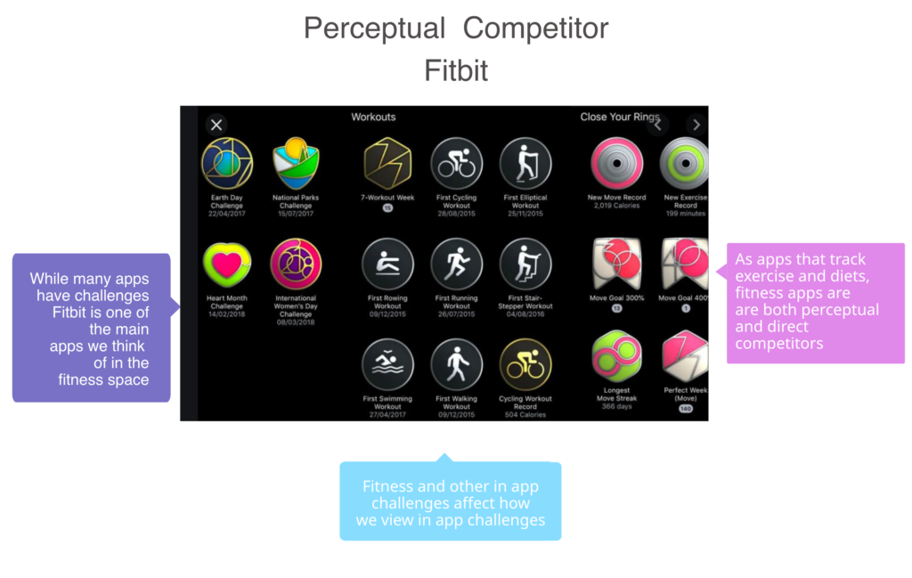
While direct competitors did not fully employ traditional gamification strategies that included challenges and badges, perceptual competitors did. While there were a limited amount of direct competitors, skin care tracking apps, there were other health tracking apps. These apps included fitness apps such as Fitbit. While Fitbit is not designed to track skincare, it does track some of the same metrics as Skinary, making the app a partial direct competitor. Fitbit is a household name that has defined the health tracking app space. It employs badges and challenges. The design of their app and their use of gamification is likely known by most potential Skinary users and directly experienced by many of them.

User Research Questions and Methodology
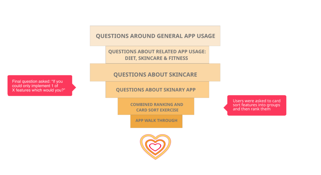
Based on the broad exposure, our potential user base had two indirect competitors that employed health tracking and gamification that overlapped with the feature that I was designing. I developed a research methodology to gain a broad amount of honest insights into our users daily interactions. By employing a broad questioning strategy, I was able to mostly avoid users telling me what they thought I wanted to hear. In addition to broad initial questions, we had users rank 5 potential features in order of importance. I refined the questions and the ranking system by working with my program mentor and meeting with the cofounder and her team.

Defining App User Profiles
Through my research interviews I was able to define 2 distinct user profiles.
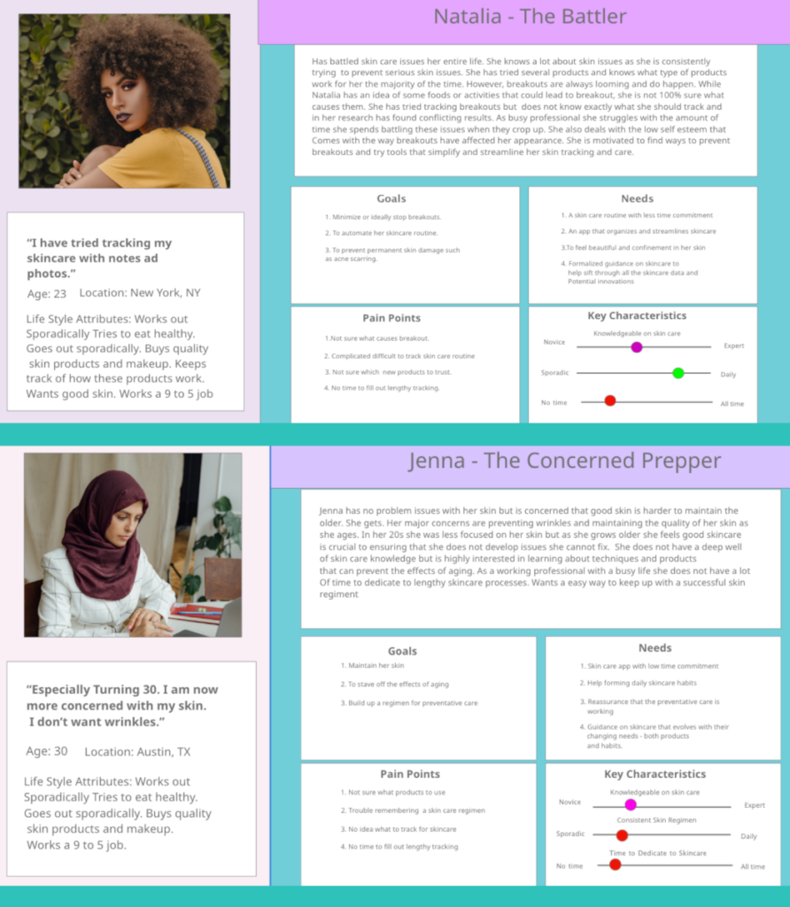
Research resulted in two profiles. The first profile which I have titled “The Prepper” is the casual user. It accounted for most users. This group has good skin and is trying to maintain it. This user’s main concern is preventing aging issues and the odd blemish. They typically do not have a lot of experience with skin tracking, or a large base of skincare knowledge. The largest challenges with this user is the need for education, and keeping their attention long enough to see results. They are also busy and are more likely to see the tracking elements as too much work.
The second user profile is “The Battler”. They represent a smaller amount of users, but would be the most active of the potential user groups. This profile represents someone with present and past issues. They are likely to have more skincare knowledge, strong routines, and to have done some form of skin tracking. The greatest challenge with this user is making sure to provide a seamless experience that does not add a lot of work to their current skin care routine but rather simplifies it.
Neither group is defined by age, sex, or race. These groups are defined by their habits. This means the gamification has to be designed for a large segments of key demographics, which means the elements have to have mass appeal. While these two user types have different ways of interacting with the app, they do share some overlapping exceptions.
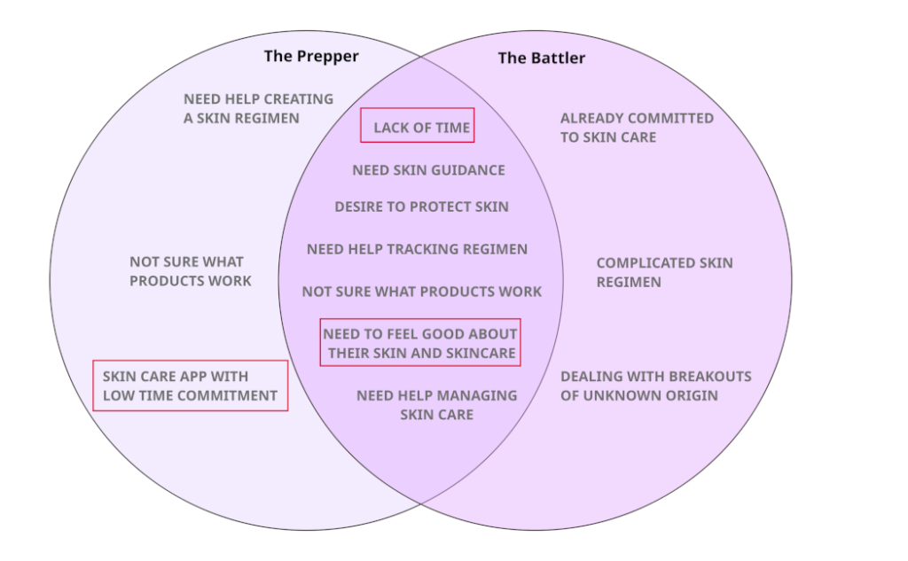
This Venn diagram shows the overlapping user experience issues I kept in mind while addressing my gamification app. While I would not be able to
make the app require less work, I could ensure that the gamification features did not create more work and would help users feel good about
their skincare. After defining both profiles, I determined that “The Prepper” or casual user would benefit the most from gamification features.

Empathizing with My Intended User
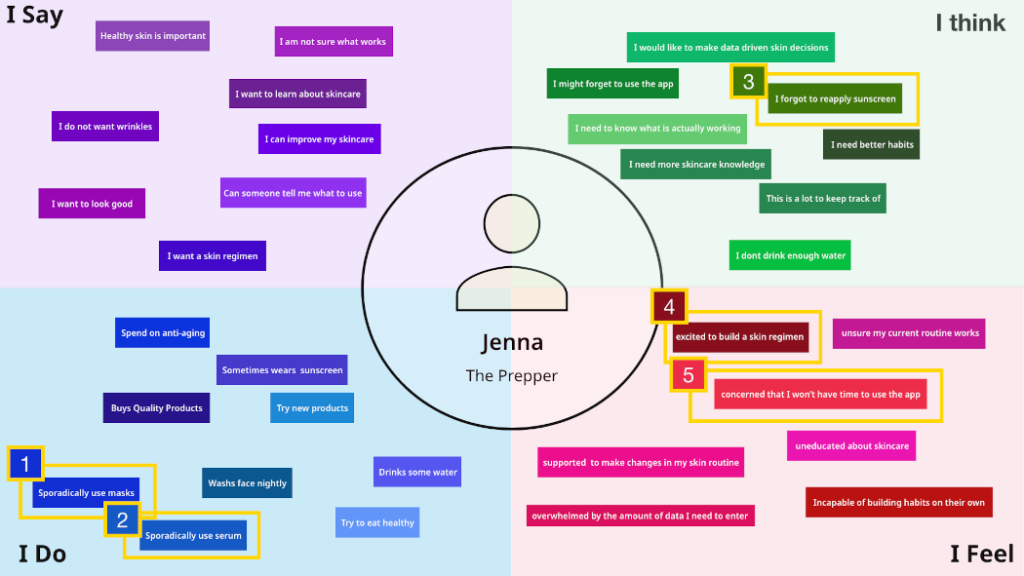
I created an empathy map by analyzing common phrases and themes shared by users that fit “The Prepper Profile” during my research interviews. Separately these comments may not seem like large insights. However, the fact that users shared similar feelings, thoughts, actions and statements led me to important design conclusions. I honed in on specific elements that I felt were useful for creating the gamification features:
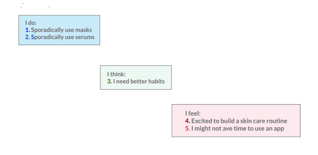
I refined my design goals to solve the following question, “How do I help users enjoy using Skinary, become excited about skin tracking, build solid skincare habits, and see long term benefits?”.

Outlining the User Journey
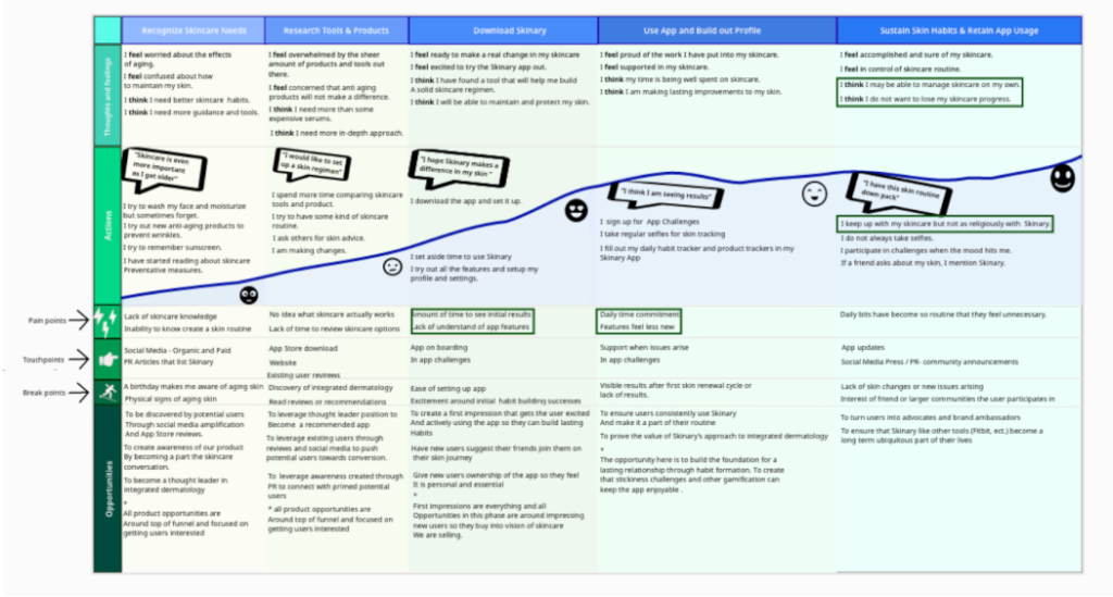
During the user reach interviews, I also walked users through the beta app and asked about the original gamification designs the stake holders had scrapped. These questions helped inform Phase 3, 4, and 5 of the user journey.

Upon downloading the app, users are likely to assume a large commitment to the app and be overwhelmed by a lack of understanding of the features.

Users are still likely to struggle with the time commitment of skin tracking as results take time. Initially this may have been slightly offset by the
Excitement of trying out the apps features. At this point the receptive actions may start to feel tedious.

By Phase 5, Users should have a handle on using the app and the pain points of Phase 3 and Phase 4 should be overcome. As a result, users should be seeing results if they are properly using the app. If habits are formed, users might believe they do not need Skinary or to track their skincare. They may slowly become less engaged in the app.

My user research led me to 3 main conclusions. Users overwhelmingly said that they had concerns with how much time the app took to use. The idea of challenges excited them, but they wanted more variance than was present in the original prototype. When asked about specific feature, additions they honed in on what was developed through the stakeholder interviews.
After having a meeting with the founder and her team, I decided to build out two features: a traditional challenge feature to engage new users in habit building, and an additional feature to provide positive long term support for new and long term users.

Gamefication Feature 1 Challenges
To address the issue of helping casual users build habits, I decided to build out a challenge feature based on the challenges seen in apps considered
to be traditional competitors. Users could use these challenges to add an element of fun to challenge building. We could also set up awards so that users would see their achievements and enjoy their success.
User Flow Challenges
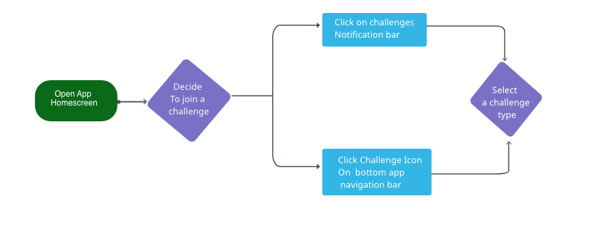
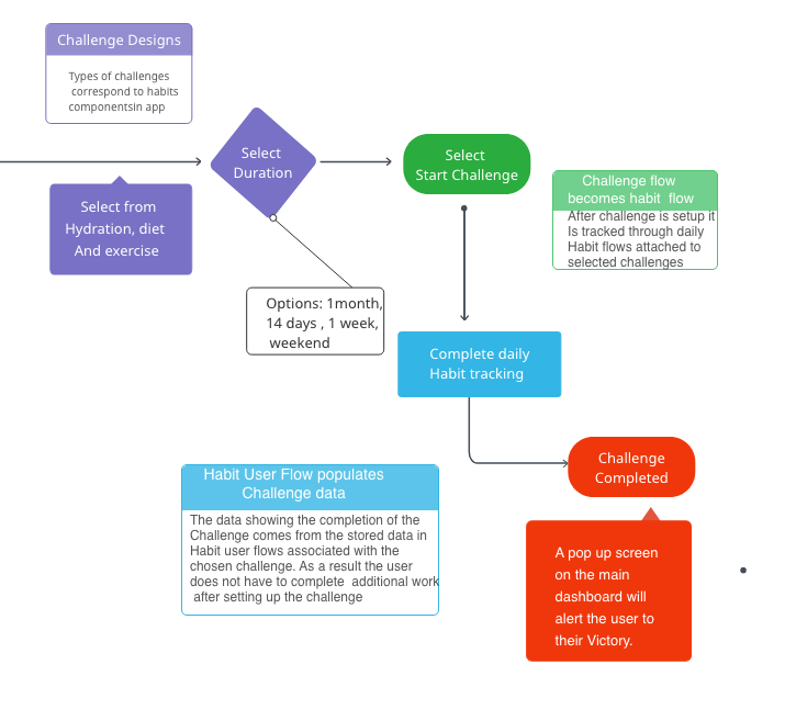
To ensure that the feature was light weight for the user, it was important to build out the user flow as a part of the habit user flows. Having users access the challenges only from a separate screen would require the user to do extra work.

Challenges Feature Wireframes & Mock Ups
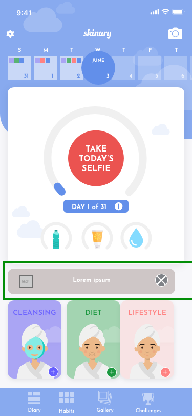

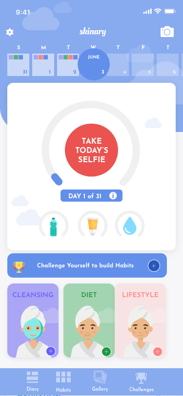
Pictured above are the wire frame and a couple of mockups for notifications encouraging challengers to join a challenge or stick with it. This notification also creates an access point for the challenges page in the dashboard.
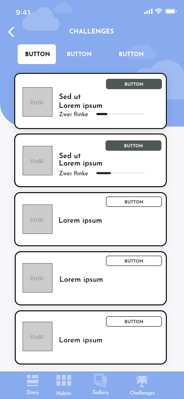
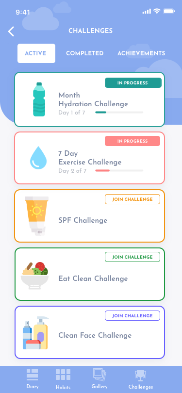
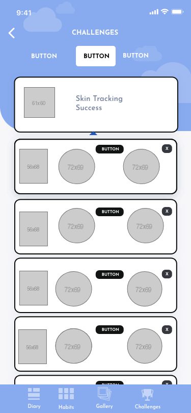
These are the challenges dashboard screens. I simplified the original designs to combine navigation for the active and completed challenges with the achievements page. The completed challenges were originally combined with the active ones ,which resulted in a large amount of scrolling for users.
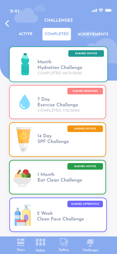
I moved the completed challenges to their own page to declutter the active challenges. Users can still see their completed challenges easily by clicking the word Completed. New Challenges were accessible from the active challenges page. Below active challenge types, are listed the available options which are not active. All active challenges have a filled in label on the top that say “In Progress” and challenges that are not currently active will have a clear label that say “Join Challenge” . This way users and quickly see which challenges they are not yet a part of.
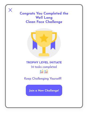
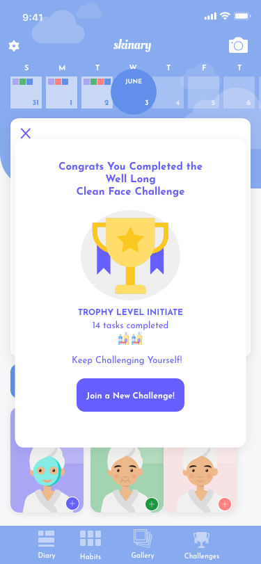
Once a challenge is completed, users would receive a notification congratulating them. Listing the amount of tasks completed, as well a trophy with a level for example “Initiate”. At the bottom is a button titled “Join a New Challenge!” and users can click on it to join a new challenge.
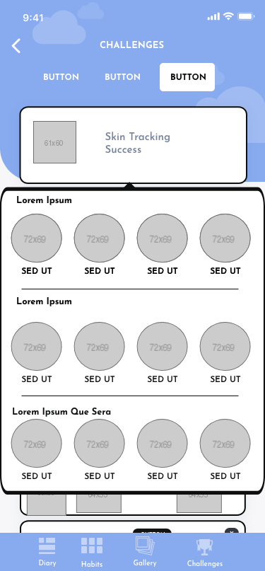
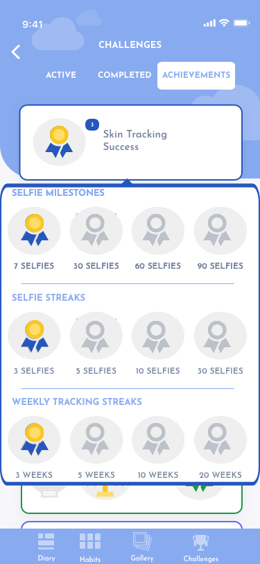
Users would also receive a notification for individual automatic achievements to the achievements dashboard, which were kept from the original design. I did not design these specific achievements or make changes to them. They are only a part of my design in the changes I have made to the dashboard. Users would then have all of their current trophy levels listed for each challenge type that has been completely below. Users can click on the challenge success notification as well as the trophies below to access a pop up window showing the achievements.
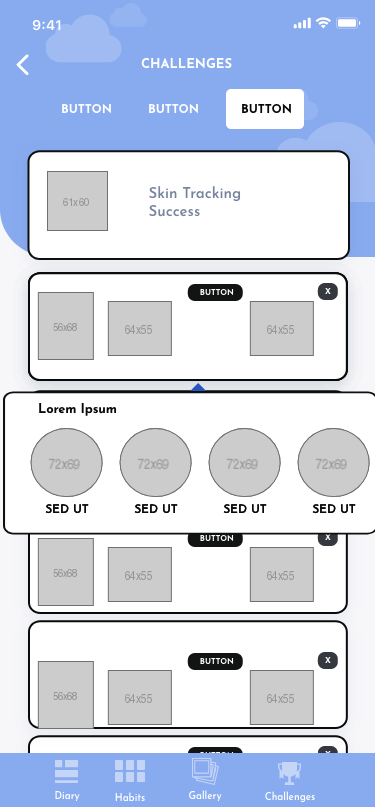
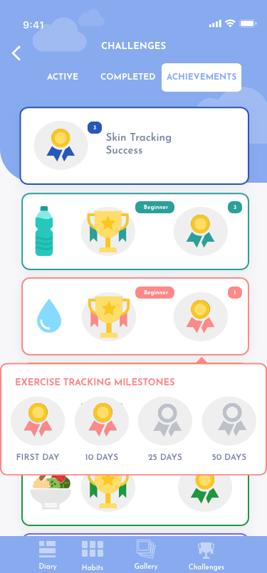
Originally these were to all be listed out in a more comprehensive dashboard, which would require users to scroll to view achievements. Given the feedback asking for light weight items that did not take a lot of time, I focused greatly on streamlining the challenge section so that users could access the features they were interested in without having to access additional features.
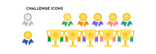
I changed the icon designs. I delineated the achievements by ribbons whose colors would correspond to the color used for the type of challenge. The challenge achievement level would be designated by trophies with ribbon colors matching the color designating the type of challenge. I designed all the elements of the challenge feature to be easy to replicate so that as new challenges are created, the text would be the only element
that would have to be created from scratch.

Gamefication Feature 2: Affirmations User Flows, Wireframe & High Res Mock Up
The second feature I designed was the affirmation feature. Users would receive a daily affirmation that showed up when users accessed the selfie features. Taking skin tracking selfies are challenging and potential users overwhelmingly chose this potential feature as the top feature they would want. This feature would add to the user experience of both of our identified user profiles.
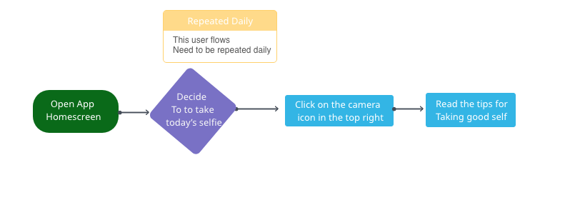
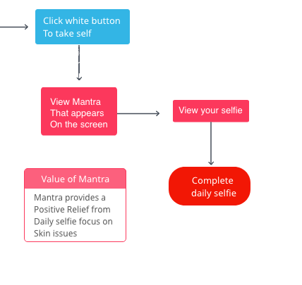
This particular element fits squarely into the user flow for the Selfies feature. This means that users would not be required to do any extra work to access it.
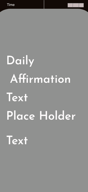
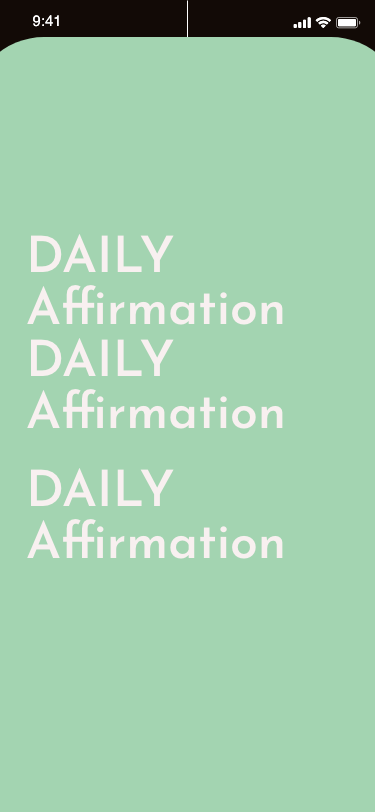
As you can see from the wireframe and mock up, the design is simple and was chosen via a stakeholder meeting where I presented designs that had decorative borders. The decision was made to focus on the words in the text and not detract from the design. Adding new affirmations would be simple, especially since they are already used as a part of Skinary’s social media campaign. The build for this feature would ultimately be easy and continually update.

Protyping and User Testing
This creates a focused user flow that drives the next step was to incorporate the new design elements, I created into the already created larger prototype. I then ran user testing by showing my prototype to brand new users that fit the casual user profile. The notes I received were mostly about ensuring the user flow would work well to ensure that the user experience remained fluid:
- Overall design of challenges looks sleek
- Colors outlining the different challenges are helpful
- Users would like to see variance of the challenge duration and would to see continued variance of offered options
- Challenges need incentive down the line to keep users interested after onboarding
- Users like the sleek and modern look of affirmations but would like the affirmation to disappear automatically after a couple of seconds
- Affirmation need to be updated regularly so they don’t feel stale
- Users suggested testing the opacity of the affirmation screen and the size to allow the users to see the selfie screen under it
- Affirmations and challenges need to be in the onboarding so users can understand how to use them
.

What I learned
Overall working with Skinary was a great experience and really helped me put into practice the theories we worked on in the She Designs Program. The experience gave a good understanding of how to come into an existing team and contribute to an established product. I really gained an understanding of how to create original work that fits a clients needs and design aesthetic.